Q&A with Amanda Shields
Sep 14, 2023 | Carpet One Floor & Home
Design by AMANDA SHIELDS | Photography by MIKE CHAJECKI
Delve into the art of balanced textures, soothing shapes, and illuminating light as expert designer Amanda Shields guides us through her vision of creating a functional yet tranquil abode.
Could you share with us the inspiration behind this modern, minimalist home?
The ideas for this design project were rooted in creating a calming and zen-like environment for a client with a stressful and emotionally draining job. The client's affinity for minimalism and mid-century modern design formed the basis of the project. By blending these two styles, we aimed to achieve a harmonious balance between simplicity and sophistication in a minimalist home.
Minimalism's clear surfaces and uncluttered areas provide a sense of calm, while mid-century modern elements offer warmth and nostalgia. The result is a space that serves as a retreat from the client's demanding work life, enveloping them in the benefits of a serene and visually appealing ambiance.
Minimalism is a significant aspect of this design. How did you approach incorporating minimalist elements in the home without sacrificing functionality and practicality in any of the rooms?
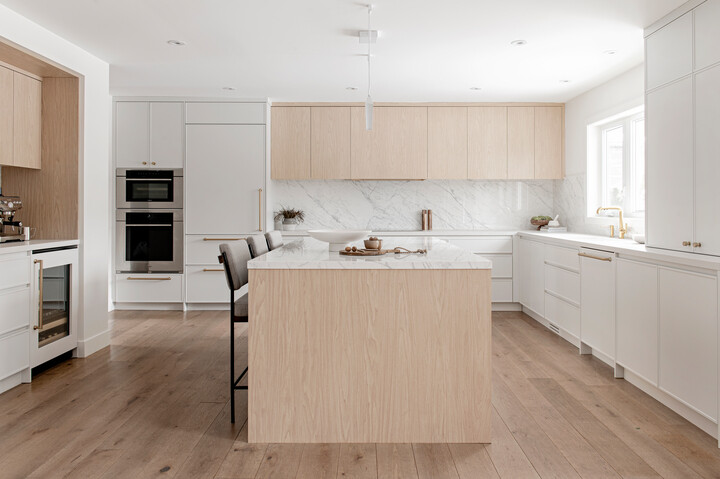
Incorporating the idea and beauty of minimalism while maintaining functionality was pivotal in our design. Within the kitchen, the focus was on a clutter-free environment, achieved through concealed storage and drawers, slim shaker cabinets, and a hidden range hood.
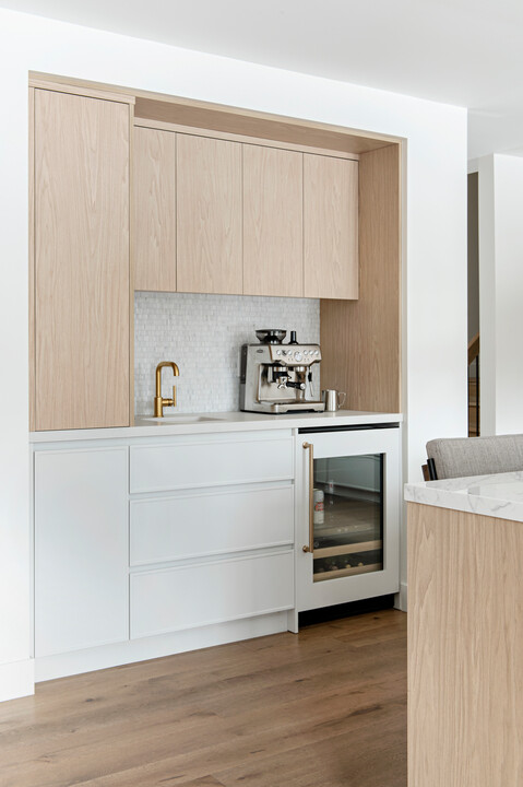
A discreet coffee bar within the drywall, complete with a closing cabinet, preserved the clean aesthetic while prioritizing practicality. Subtle porcelain surfaces and minimal linear lighting complemented the minimalist feel. This balance between minimalism and usability created serene spaces that are both visually pleasing and functional.
The flooring choices play a crucial role in tying the design together. Could you tell us a bit about the flooring materials you selected for each space and how they enhance the overall aesthetic?
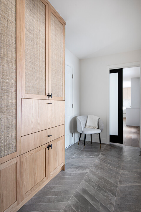
In the kitchen, for example, we embraced engineered white oak wide plank hardwood for its warmth and compatibility with wooden elements. The mudroom features concrete-look porcelain tiles in a larger chevron pattern with subtle tonal grout, providing interest yet maintaining a seamless transition.
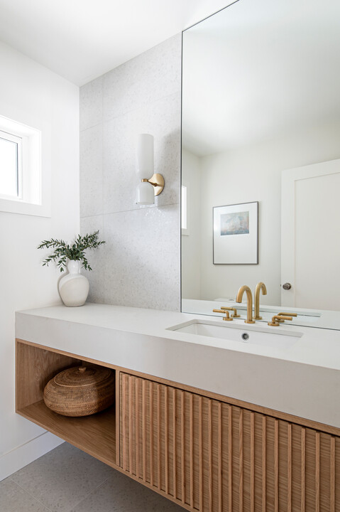
In the powder room, large-scale porcelain tiles with a soft terrazzo pattern maintain minimalism while offering visual interest. These thoughtfully selected flooring materials tie areas together while enhancing the overall aesthetic of the home renovation with their unique textures and patterns.
Lighting is essential in any interior design project —how did you utilize lighting techniques to enhance the bright and refreshing feel of the minimalist house?
Leveraging ample natural sunlight through large windows, we enhanced the effect with well-placed pot lights for general illumination. Undermount lighting throughout the walls of the kitchen added a functional layer that highlighted countertop workspaces.
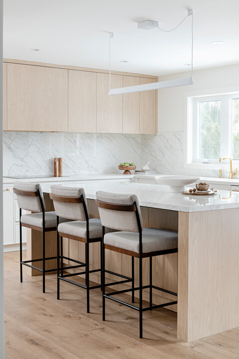
A minimal linear light above the kitchen island provided a contemporary flair, while the powder room's statement sconce with tonal white glass added subtle intrigue. This harmonious interplay between natural and artificial lighting fostered an inviting atmosphere across the home.
We love the hidden office nook. How do you approach designing a multipurpose work space?
Making a versatile workspace, like the hidden office nook in the mudroom, requires a blend of creativity and unconventional thinking. The approach involves striking a balance between optimizing space utilization and avoiding overcrowding. Central to this process is a comprehensive understanding of the client's requirements.
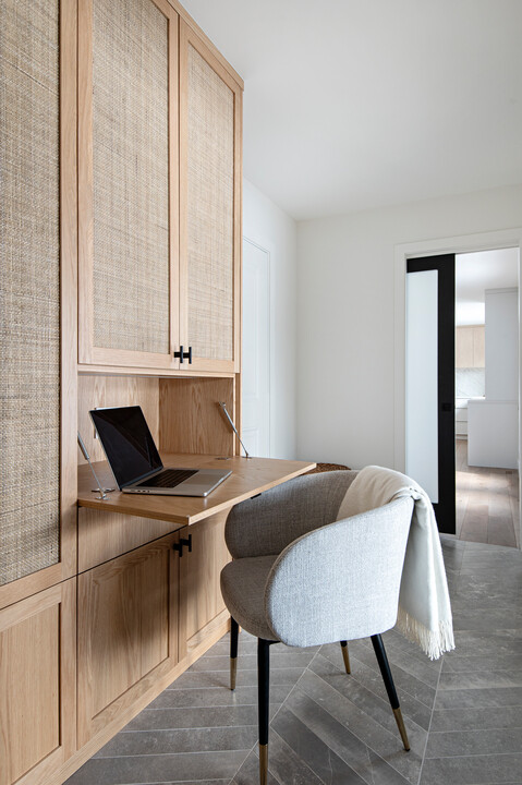
I delve deeply into their needs and how they envision the space's functionality. By thoroughly exploring these factors, I ensure that the final design seamlessly aligns with their work habits and lifestyle, transforming the area into a multipurpose haven that enhances productivity without compromising on aesthetics.
In a home with a minimalist approach, storage solutions become essential. Could you share some innovative storage ideas you incorporated into the project for these areas?
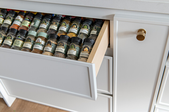
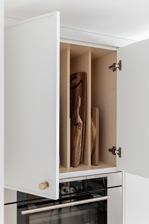
In the kitchen, we designed a pull-out spice drawer and a slotted cabinet for baking sheets. These solutions ensure that kitchen essentials are easily accessible yet neatly tucked away, promoting key benefits of a minimalist lifestyle and an uncluttered appearance. The hidden range hood not only contributes to the minimalist look but also conserves valuable space, allowing the rest of the kitchen design to shine.
A standout innovation lies in the coffee bar, which features a unique pull-out tower designed to house liquor bottles and barware. This space-efficient solution combines both functionality and style, cleverly integrating storage.
Creating a timeless design is often a goal for many interior designers. How do you anticipate this home will stand the test of time and remain relevant in the years to come?
The key lies of course in striking a fine, delicate balance between contemporary aesthetics and enduring design principles. By anchoring the design in minimalism, we establish a foundation that transcends fleeting trends. Thoughtful material choices, such as natural wood and subtle textures, contribute to the timelessness.
Iconic, functional furniture pieces, combined with clean lines and uncluttered areas, evoke a sense of familiarity while remaining fresh within the design. By integrating these inventive storage ideas, we ensured that each space remains streamlined and free from visual clutter, seamlessly aligning with the minimalist philosophy while catering to practical needs.
Natural light seems abundant in this project. How did you maximize natural light throughout the home, and how does it contribute to the overall ambiance?
Natural light was integral to the project's success, crafting an inviting ambiance throughout. To maximize this light, we strategically designed the first floor layout to prioritize large windows in key areas. Placing these windows strategically allowed sunlight to flood into the spaces, enhancing the overall brightness and openness.
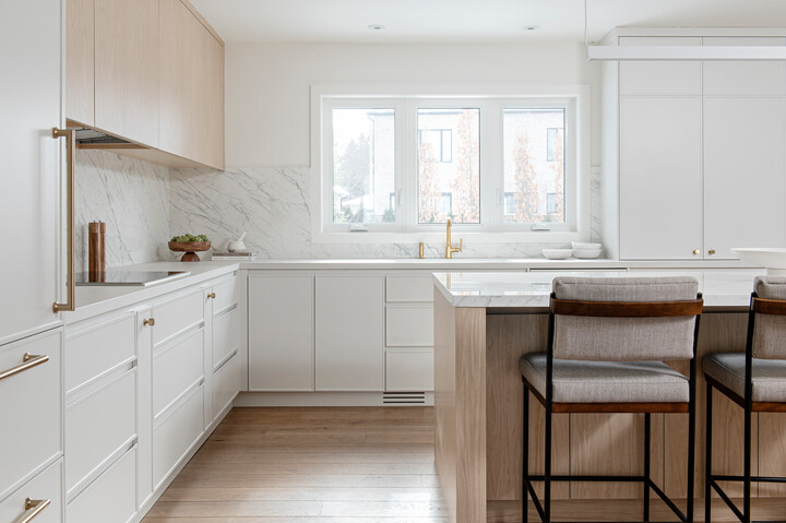
Furthermore, we chose light-reflective materials and a soft colour palette that amplifies the natural light's effect. These choices ensure that the rooms feel airy and welcoming, even on overcast days. The result is an interior that feels interconnected with the outdoors, fostering a sense of tranquility and well-being.
By thoughtfully using light fixtures and harnessing natural light, we created a harmonious environment that not only enhances the visual appeal but also uplifts the overall living experience throughout the home.
Minimalist design often involves a careful selection of statement pieces. Could you highlight some key statement pieces in the home that add character to the spaces?
Incorporating character within minimalism required selecting statement pieces that subtly enhance visual interest while adhering to a tonal palette. Notably, the fluted wood stain vanity in the powder room exemplifies this approach.
It adds texture and repetition without overpowering the space. Similarly, the mudroom wall cabinetry integrates touches of rattan, introducing warmth and texture into one room. These thoughtfully chosen pieces contribute distinctiveness within the minimalist framework, enhancing the overall appeal of the home.
Lastly, what advice would you give to those looking to add minimalistic design elements to their own home?
For those seeking to infuse a minimalistic design into their homes, a few guiding principles can pave the way for success. Start by decluttering and embracing simplicity. Remove unnecessary items and streamline your home decor. Choose quality over quantity, opting for a few well-designed pieces that truly resonate with you.
Prioritize functionality in your design choices. Every element should serve a purpose and contribute to the overall harmony of the space. This includes smart storage solutions that keep your surroundings uncluttered. When it comes to colour palette and materials, it's important to keep the following in mind:
Stick to a neutral colour palette and minimalist decor, incorporating whites and soft tones to establish a serene backdrop.
Incorporate natural materials like wood and stone for warmth and texture.
Embrace clean lines and unadorned, minimalist surfaces.
Finally, let light be your ally. Maximize natural light by strategically placing windows and using light-reflective materials. Implementing well-designed lighting fixtures can also enhance the overall atmosphere.
Remember, minimalism isn't about starkness; it's about intentionality. Every element should contribute to the whole while allowing you to create a space that truly reflects your personal style. By following these principles, you can embark on a journey to create a minimalist haven that stands the test of time.
Amanda Shields is the creative director and principal designer of Amanda Shields Interiors. The design firm is known for and focused on creating stylish and approachable family-focused interiors.
Stay current with the hottest trends and ignite your creative spark with top-tier sources! Embark on a journey through our Beautiful Design Made Simple blog, where our flooring experts and interior designers share valuable advice and perspectives to elevate your home design experience.